Enhancing D365 with Customized Editable Grids
All articles from this blog can ONLY be redistributed on an Attribution-NonCommercial-NoDerivs basis. Please credit the source, thank you.
Twitter:@kelvinshen
Blog:Kelvin Shen's Blog
Intro
I have many years of D365 project delivery experience under my belt. There is always a demand for UX/UI improvement.
With many years of D365 project delivery experience under my belt. I’ve seen consistent demand for UX/UI improvements. Enhancing user experience is critical, and Power Apps Code components offer developers the tool they need to meet specific UI requirements.
Power Apps Code Components
The Power Platform Component Framework (PCF) empowers developers to extend Model-Driven Apps (MDAs) with custom UI components, tailored to specific needs, such as applying conditional formatting to highlight critical information.
Code Components for forms
For instance, on forms, developers can create custom components like a choice picker to enhance field/column interactions.
Code Components for views
For views, developers can build a Data Set Grid component, providing a more interactive and customized data presentation.
Learn more about Data Set Grid components
Customized Editable Grid
The Customized Editable Grid is a unique type of component. Unlike standard PCF components, it allows developers to manipulate rendering at the cell level, reducing the overall development effort. This flexibility makes it a powerful tool for tailoring grids within D365.
My Demo Project
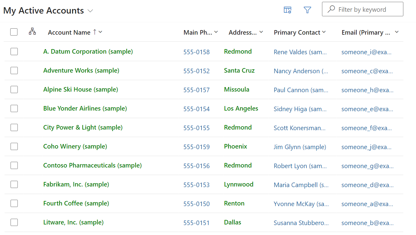
The demo project is simple yet effective: it renders text content in D365 view columns in green, providing a visual cue for users.
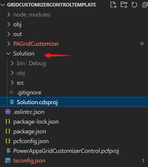
The Project Template
The template control is available in the PowerApps-Samples GitHub repository. You’ll need to clone or download the repository to access the files in PowerApps-Samples/component-framework/resources/GridCustomizerControlTemplate.
Entry Point
The entry point is the init function of the index.ts file. The key functions, cellRendererOverrides and cellEditorOverrides, will be modified to achieve the desired customization.
    public init(
        context: ComponentFramework.Context<IInputs>,
        notifyOutputChanged: () => void,
        state: ComponentFramework.Dictionary
    ): void {
        const eventName = context.parameters.EventName.raw;
        if (eventName) {
            const paOneGridCustomizer: PAOneGridCustomizer = { cellRendererOverrides, cellEditorOverrides };
            (context as any).factory.fireEvent(eventName, paOneGridCustomizer);
        }
    }
The Sample Code
I have simplify the sample code by removing the currency cell renderer logic.
import { Label } from '@fluentui/react';
import * as React from 'react';
import { CellRendererOverrides } from '../types';

export const cellRendererOverrides: CellRendererOverrides = {
    ["Text"]: (props, col) => {
        // Render all text cells in green font
        return <Label style=>{props.formattedValue}</Label>
    }
}
Build the Project
To build the project, start by installing the dependency packages:
npm install
If you encounter missing type definitions, run the following script:
npm run refreshTypes
Finally, build the project:
npm run build
If the build process complains about missing lint configuration, use the .eslintrc.json configuration below:
{
    "env": {
      "browser": true,
      "es2021": true
    },
    "extends": [
      "eslint:recommended"
    ],
    "globals": {
      "ComponentFramework": true,
      "JSX": "readonly"
    },
    "parser": "@typescript-eslint/parser",
    "parserOptions": {
      "ecmaVersion": 12,
      "sourceType": "module"
    },
    "plugins": [
      "@microsoft/power-apps",
      "@typescript-eslint"
    ],
    "rules": {
      "no-unused-vars": "off"
    }
}
If the lint validation fails due to an empty constructor, try delete the node_modules folder and reinstall the dependencies:
npm install
Package Solutions for Deployment
To package your solution, first install the Power Platform Tools VSCode extension.
- Create a folder for hosting solution. Choose a meaningful name, as it will be used for the solution.
Solution display name shown after imported into the target environment
- Initialize the solution project folder:
pac solution init --publisher-name Samples --publisher-prefix samplesReference: Microsoft Documentation
- Add a reference to the PCF project folder, which should contain a
.pcfprojfile:pac solution add-reference --path ..\Note: you can reference multiple PCF project folders
- Generate the solution zip file using .NET 6 SDK. To do this, navigate to the
cdsprojsolution project directory and run:dotnet build
Implementing a Grid Customizer Control
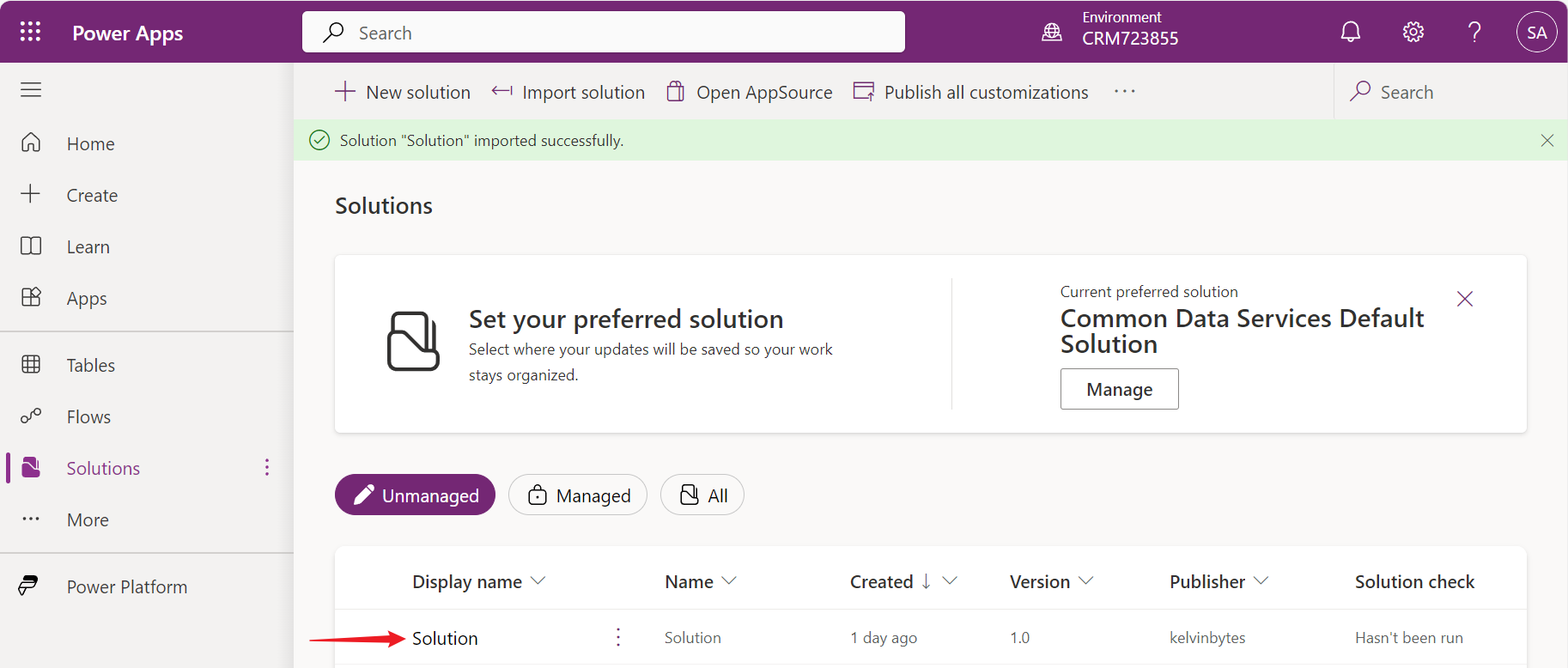
To implement the grid customizer control, first import the package solution into the target environment. Then, follow the detailed steps in the Microsoft documentation.
Upgrade a Grid Customizer Control
If you make some updates to the grid control customizer, but the change didn’t come through after deployment. Please try the following:
- Update the version in the ControlManifest.Input.xml file.
- Delete the solution and its component(s), re-import the solution.
Final Result